ⓘ This post is more than 7 months old.
Note: There is dispute regarding the validity of some of the results of this paper which came to my attention after writing this post. Treat its results with caution.
This post has two parts. The first part is reading the paper, the second part is playing with the code.
Neel Nanda's takes on the paper:
Deeply engage with:
- The core intuitions: what is superposition, how does it respond to feature importance and sparsity, and how does it respond to correlated and uncorrelated features.
- Read the strategic picture, and sections 1 and 2 closely.
Skim or skip:
- No need to deeply understand the rest, it can mostly be skimmed. It’s very cool, especially the geometry and phase transition and learning dynamics part, but a bit of a nerd snipe and doesn’t obviously generalise to real models.
1. Reading the paper
1.1 The intro
Goal: "Use toy models to investigate how and when models represent more features than they have dimensions." Result: "When features are sparse, superposition allows compression beyond what a linear model would do, at the cost of 'interference' that requires nonlinear filtering"
Immediately wondering about whether multilayer networks allow for more distributed stuff — e.g. maybe there are enough features across the whole network but not in this single layer.
1.2 What is the linear representation hypothesis
- Under the linear representation hypothesis, features of the input are represented as directions in the activation space. This hypothesis can be separated into two hypothesized properties of neural networks:
- Decomposability: You can separate a network's representations into multiple independently comprehensible features
- Linearity: Features correspond to directions in the model (somehow)
- This seems insane as a claim about larger models?
- How does this square with the research previously done on induction heads/head composition in our 1-layer transformer?
- Sometimes "features" (semantically relevant groupings of activations?) correspond to "neurons" (directions in the model's latent space). When does this happen?
- If you have a privileged basis, i.e. there's an architectural aspect of the model that encourages features to align with dimensions2, you're more likely to see neurons corresponding to features
- If you have fewer neurons than features you want to represent, the model may use superposition to compress them all together, in which case neurons are less likely to correspond to features. (big intuition: neural networks simulating larger, sparser networks. This is an important thing I think I will take away from this paper.)
Superposition had been previously hypothesized. The point of this paper is to demonstrate it unambiguously, and flesh out relevant or related ideas. This agenda is motivated by a bunch of different places where we have observed (or debated observing) nice structure inside models like this:
- Word embeddings seem to have meaningful directions
- Other latent spaces (e.g. in GANs) have seen similar directions
- Previous debate over whether we had found genuinely interpretable neurons inside RNNs, CNNs, GANs, etc.
- Seems like some neurons are convergent, i.e. multiple networks have neurons corresponding to same property
- Many neurons are uninterpretable (respond to lots of random stuff)
This begs the question, what is a feature? It's hard to give a precise definition. (Interesting!) Some options:
- Any function of the input (kinda not that helpful)
- Human-interpretable concepts present in the activations or inputs; maybe falls short because we want to be talk about features that might be there but which we don't understand, e.g. alphafold discovering some important new chemical structure
- A neuron in a sufficiently large model: it's a feature if a large enough model would dedicate a neuron to representing it
- Other stuff I've read about feature absorption/hierarchical features in SAEs makes me wonder whether this would really work as a definition. I think I am skeptical; it feels like this suggests an inappropriately 'flat' ontology of features
- I still think this definition is useful and interesting to think about; indeed it is because it is the way the authors think about features for this whole paper, though they "aren't overly attached to it" and "think it's probably important to not prematurely attach to a definition."
1.3 Why are linear representations plausible?
Let's give a precise mathematical definition to 'linearity' in this 'linear representation' sense. If every feature $f_i$ has a direction $W_i$ (a matrix because it's a linear combination of basis vectors of the activation space) and activates with amount $x_i$ , then our activations as a linear combination of our features should be written as $x_1W_1 + x_2W_2 + ... x_jW_j$. Note, then, that 'linearity' here only means that the activations are linear functions of features — it is not saying that the features are linear functions of the inputs.
Why should we expect this to be the case? Why is this a reasonable thing to wonder about? The paper gives 3 bullet points but there's an interesting observation right before so I'm calling it 4 reasons. Here is how I understand them. Take this with a grain of salt, I don't think it's entirely correct:
- Neural networks are linear computations composed with nonlinearities, but the linear functions make up most of the computation (in FLOPS)
- Some obvious algorithms (e.g. "matching similarity to a template" which would provide a 'feature') are very simple to implement (e.g. since we are taking dot products when we do matmul, meaning a neuron describing 'how much an input matches some template' is very easy to implement) and so it's reasonable to expect the network to be doing them
- Linear representations are convenient for the next layer to use; if features are represented linearly, then the next layer can easily access and work with them. If not, the model will need to do more complex nonlinear computations to access the features, which seems more inefficient.
- Representing features linearly might make them generalize better, further out of distribution, when you're doing linear transformations, whereas nonlinear functions might have weirder behaviors out of distribution (==??? I think I am misunderstanding this one in particular==)
There seem to be three kinds of arguments here: (1) that neural networks architecturally have an inductive bias towards linear representations (2) that linear representations are more efficient for doing computations (3) that linear representations are more accurate, i.e. generalize better.
Also this goes hard:
For discussion on how this view of features squares with a conception of features as being multidimensional manifolds, see the appendix “What about Multidimensional Features?”.
1.4 Why is superposition of linear representations plausible?
Superposition describes a model exploiting sparse inputs by having many "almost-orthogonal" features at the cost of some interference, allowing them to "noisily simulate a larger model" that has more neurons than it does.
We have two nice mathematical results that make superposition more plausible:
- Almost-orthogonal vectors: put simply, while you can only have $n$ exactly-orthogonal vectors in an $n$-dimensional space, the number of "almost-orthogonal vectors" you can have explodes exponentially with $n$. The actual math result, the Johnson-Lindenstrauss lemma, says something like "as the number of dimensions in your data increases, the number of dimensions you can project that data down to with very minimal distortion increases logarithmically." See below for details.
- Compressed sensing: Normally projecting down to a lower dimension loses information. But if the vector is sparse, you can often recover the original vector.
With the Johnson-lindenstrauss lemma in mind, we can give a nice mathematical criterion for superposition: if $W^T W$ is not invertible but the representation is linear and decomposable, the representation will exhibit superposition. It's not clear that this actually gives us much empirically to work with, but at least we have a nice description.
1.4.1 The Johnson–Lindenstrauss lemma
The proof uses knowledge of probability theory that I don't have, but I can understand the statement (first part from Wikipedia, second formulation is my own but certainly not novel):
Given $\varepsilon \in (0,1)$, a set $X$ of $N$ points in $\mathbb{R}^n$, and an integer $k>8(\ln N)/\varepsilon^2$, there is a linear map $f: \mathbb{R}^n \rightarrow \mathbb{R}^k$ such that, for all points $u,v \in X$, $$(1-\varepsilon) ||u-v||^2 \leq ||f(u)-f(v)||^2 \leq (1 + \varepsilon)||u-v||^2$$ which we can also write as, if we are courageous with our absolute value notation,$$\bigg| ||f(u) - f(v)||^2 -||u-v||^2 \bigg| \leq \varepsilon ||u-v||^2$$ Note that there are no constraints on the value of $n$, the original embedding dimension, only on $N$, the number of points.
The second formulation is one I just wrote down. If you're familiar with analysis proofs you might like the second one slightly better.
Let's put this a bit more simply:
- Take some $\varepsilon$ very small, like 1/100.
- Then you are guaranteed to be able to project your points into a space of dimension $k$ (will talk about $k$ in a second) such that
- for any pair of points $u$ and $v$, the squared distance between them after projection $||f(u)-f(v)||^2$ lies very close to their original squared distance.
- How close? More precisely, $||f(u)-f(v)||^2$ must be within $\varepsilon||u-v||^2$ of the original distance $||u-v||^2$ — i.e. the difference between the distances before and after projection is a fraction of the original distance. That fraction is defined by epsilon.
- For example, if $\varepsilon = 1/100$ then after projection $||f(u)-f(v)||^2$ must be, at most, different from $||u-v||^2$ by one one-hundredth of $||u-v||^2$.
The important part is the condition on $k$. It's given that it's an integer $k>8(\ln N)/\varepsilon^2$, but this doesn't tell us that much intuitively. If we rewrite this, though, it looks maybe more like what we want (exponential) but it is still also not obvious how $k$ behaves: $e^{\varepsilon^2k/8} > N$. When we look at examples it becomes clear: we get something that's quite underwhelming at lower dimensions but awesome in higher dimensions. Let's look at examples.
Let's say $\epsilon = 1/100$, i.e. we want to preserve distances to 1/100th of the original length. For $N = 100$, 100 points, this is kind of dumb-looking and trivial: the lemma tells us we can project into a space of dimension $k = 3685$ and preserve distances relatively well. Uh, thanks? I already know we could project from $\mathbb{R}^n$ into a 100-dimensional space with no distortion, because the span of 100 vectors is at most 100-dimensional.
For $N=100,000$, however, the result becomes mind-blowing: keeping $\varepsilon$ the same, we can project 100,000 datapoints (say, 100,000 orthogonal vectors) to a space of dimension $k = 9211$ with limited distortion. As we scale orders of magnitude, it becomes even more impressive: for $N = 10,000,000$ we can project into a space of size $k = 12894$. That's right — ten million datapoints of arbitrary dimensionality can be projected into a space of only 12,894 dimensions with this minimal amount of loss. This trend gets even better the bigger you scale the dimensions; $k$ is increasing logarithmically. Thus our result: you can fit $exp(n)$ many almost-orthogonal vectors in a space where you could only fit $n$ vectors normally.
1.5 How do you actually demonstrate superposition?
Just a slight nonlinearity can make models behave in a radically different way! -Anthropic team
For our experiment we are going to work with undercomplete autoencoders: we'll project from a higher dimension to a low dimensional latent, and then see how well we recover the high-dimensional input.
At this point in the paper, the Anthropic team moves to actually executing the experiment and analyzing the results. I want to know how this is done, so I'm going to move to the code that they published with the paper. First I'll look at the simple sparsity visualization that they gave us initially, and then I'll walk through the setup (with code) that they give in Section 2 (demonstrating superposition)
2. Reading the code
2.1 Understanding how to create the headline diagram
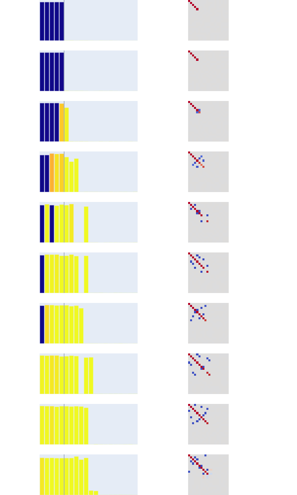
Here is what you might consider the 'headline' diagram of the paper:
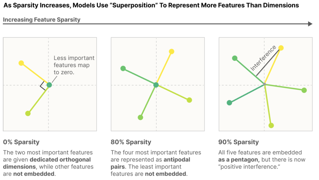
It shows a model with 2 dimensions of embedding space learning to represent a 5d embedding space.
- When features tend to fire together (dense, e.g. all the coordinates are nonzero) we get a representation of the 2d embedding space "Like what PCA would give us"
- When features fire together less and less (increasing sparsity) then we get more features embedded. My intuition for this is that interference is less costly in that situation; usually the features will not be firing together as frequently and so interference is penalized less
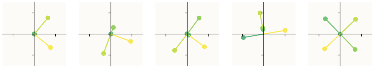
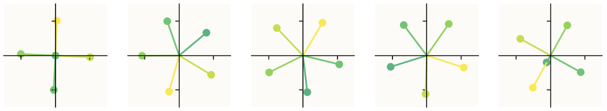
This diagram is slightly cherrypicked for the sake of making a clean visualization. Here is a larger sample now looking at 10 models with progressive sparsity increases, as opposed to just 3. (The first image is the first 5 models with sparsity increasing left to right, the second image continues with models 6-10 as you expect, from left to right.)
The obvious question: how do you produce this diagram? What exactly are we looking at? The short answer is that we are seeing where the basis vectors of the 5d input space land in the 2d latent space. This is explained intuitively and mathematically in the paper, but I want to see the code — I want to know how to do the experiment. Fortunately, they provide a GitHub repo containing code that generates this kind of visualization. (Unclear if it's the actual code they used to write the paper — I think it's modified but functionally the same, though not entirely sure.)
On a high level, we're basically instantiating multiple autoencoders (One-layer ReLU MLPs with 5 input/output dimensions and 2 hidden dimensions, simulating the "more features than dimension" problem) in one Model object, each with different input sparsity levels, which we train side-by-side using the optimize function. Then we visualize the optimized models. To reiterate, this plot visualizes where the basis vectors of the 5-dimensional input land in the 2d space, with each datapoint representing one of those basis vectors' new positions, and colors indicating the importance that was assigned to that feature (i.e. how important it is for reducing the loss). We read these new positions out of the weights matrix.
While maybe initially unintuitive, training all the autoencoders at the same time in one model, as opposed to simply instantiating 10 models in a row and training them separately, is more efficient, and also just a nicer, more elegant way to ensure your experiment is consistent across the different models; it also makes managing and accessing the different autoencoders more convenient. From here on out, I'll use "model" to refer to the whole model containing all 10 of these autoencoders, and "submodel" or "autoencoder" to refer to each of those 10 submodels that this code trains. Let's walk through the code!
2.1.1 The Model Object
We first define a Model object. The Model object has one weights parameter self.W of shape n_instances, n_features, n_hidden initialized using torch.nn.init.xavier_normal as well as an output bias of shape n_instances, n_features.
def __init__(self, config,
        feature_probability: Optional[torch.Tensor] = None,
        importance: Optional[torch.Tensor] = None,
        device='cuda'):
    super().__init__()
    self.config = config
    self.W = nn.Parameter(torch.empty((config.n_instances, config.n_features, config.n_hidden), device=device))
    nn.init.xavier_normal_(self.W)
    self.b_final = nn.Parameter(torch.zeros((config.n_instances, config.n_features), device=device))

    if feature_probability is None:
        feature_probability = torch.ones(())
    self.feature_probability = feature_probability.to(device)
    if importance is None:
        importance = torch.ones(())
    self.importance = importance.to(device)
At the end of the __init__ we have two more brief pieces: we use feature_probability (by default all ones unless given as an argument when the model is initialized) to specify a feature's probability of firing, and then importance to weight the loss by how 'important' a feature is. We'll see how these get used in more detail below. The broad idea here is that they are two aspects used to make the artificial data more realistic. They are simulating the following ideas:
- In a real-world setting, most of the time most features will not be active, i.e. the features will be sparse (for example, most of the time a sentence will only contain a couple of the millions+ of concepts the model has learned; features $\neq$ concepts but it's useful for the intuition that language is 'sparse' in this sense.)
- This goes back to why we chose 5d → 2d latent space: in a real-world setting, we should expect there to be vastly more 'aspects of language' or 'concepts' than there are dimensions in the latent space — vastly more features than the model has neurons to represent.
In the natural world, many features seem to be sparse in the sense that they only rarely occur. For example, in vision, most positions in an image don't contain a horizontal edge, or a curve, or a dog head [3]. In language, most tokens don't refer to Martin Luther King or aren't part of a clause describing music [4]. This idea goes back to classical work on vision and the statistics of natural images (see e.g. Olshausen, 1997, the section "Why Sparseness?" [26] ). For this reason, we will choose a sparse distribution for our features.
- In a real-world setting, different features will be more or less important to reducing the loss: "For an ImageNet model, where classifying different species of dogs is a central task, a floppy ear detector might be one of the most important features it can have. In contrast, another feature might only very slightly improve performance"
These are the properties that we want to simulate with our synthetic data vectors $x$: the inputs have feature sparsity, they have contain features than neurons in the model, and those features vary in their importanc.e
It has the following forward function which I will walk through:
# Model object forward() method
def forward(self, features):
    # features: [..., instance, n_features]
    # W: [instance, n_features, n_hidden]
    hidden = torch.einsum("...if,ifh->...ih", features, self.W)
    out = torch.einsum("...ih,ifh->...if", hidden, self.W)
    out = out + self.b_final
    out = F.relu(out)
    return out
You can see how this is multiple models in a trenchcoat (specifically, n_instances submodels with their own weights) packaged together into a single model: the einsum operation acts like having multiple linear weight matrices. In more detail, torch.einsum("...if,ifh->...ih", features, self.W) says to "match the batch dimensions ... and the instance dimension i, and then multiply the f-dimensional feature vector by the [f,h]-shaped weight matrix." A similar operation is done to get the out to which we then apply a bias and a ReLU. In math, we have for the hidden layer (using the notation from the paper)
$$h = Wx$$with $x$ being the synthetic data vector we will generate below, then for the output $$\text{x'} = \text{ReLU}(W^Th+b)$$ which yields the full expression
$$x' = \text{ReLU}(W^TWx+b).$$
Model also has a generate_batch method:
def generate_batch(self, n_batch):
    feat = torch.rand(
        (n_batch, self.config.n_instances, self.config.n_features),
        device=self.W.device)
    batch = torch.where(
        torch.rand(
            (n_batch, self.config.n_instances, self.config.n_features),
            device=self.W.device) <= self.feature_probability,
        feat,
        torch.zeros((), device=self.W.device),
    )
    return batch
feat is a generated tensor of shape (n_batch, n_instances, n_features) with each value on the interval $[0,1)$ due to the torch.rand function. Now, torch.where(condition, input, other) takes in a Boolean "condition" tensor and two other tensors input and other and creates a new tensor out, all either the same shape or broadcastable to the same shape.
Keeping this in mind, it's most convenient to just copy the Pytorch docs here to explain what that next line does:
$$
\text{batch}_i = \begin{cases}
\text{feat}_i & \text{if }\texttt{feats_condition}_i \leq \texttt{feature_probability}_i\
\text{0} & \text{otherwise} \
\end{cases}
$$
where feats_condition is a different tensor generated in the same way as feat, and feature_probability is part of the config which tells you the probability that a feature fires. Thus batch is creating a random tensor of shape (n_batch, n_instances, n_features) with values between 0 and 1, except with indices zeroed out randomly according to the feature_probability matrix.
2.1.2 The optimize function
Now that we know how Model works (at least, the important stuff), let's understand the optimize function. Here's the code, and then I'll walk through it step-by-step because it's a slightly weird version of a training loop in order to accommodate the multiple models.
def optimize(model, render=False, n_batch=1024,steps=10_000, print_freq=100, lr=1e-3, lr_scale=constant_lr, hooks=[]):
  cfg = model.config

  opt = torch.optim.AdamW(list(model.parameters()), lr=lr)

  start = time.time()
  with trange(steps) as t:
    for step in t:
      step_lr = lr * lr_scale(step, steps)
      for group in opt.param_groups:
        group['lr'] = step_lr
      opt.zero_grad(set_to_none=True)
      batch = model.generate_batch(n_batch)
      out = model(batch)
      error = (model.importance*(batch.abs() - out)**2)
      loss = einops.reduce(error, 'b i f -> i', 'mean').sum()
      loss.backward()
      opt.step()

      if hooks:
        hook_data = dict(model=model,
                         step=step,
                         opt=opt,
                         error=error,
                         loss=loss,
                         lr=step_lr)
        for h in hooks:
          h(hook_data)
      if step % print_freq == 0 or (step + 1 == steps):
        t.set_postfix(
            loss=loss.item() / cfg.n_instances,
            lr=step_lr,
        )
optimize does the following, high-level.
It starts by creating an AdamW optimizer on the parameters of the model that it gets passed, sets up a tqdm wrapper with with trange(steps) as t:, then at each timestep:
- Scales the learning rate using the lr scheduling function
- Generates a batch using
model.generate_batchand feeds it to themodel - Calculates
error, a sort-of-MSE tensor we'll use to calculate losserroris the regular mean-squared error from the batch to the output, but weighted by theimportancetensor.- The importance tensor defaults to being
torch.onesbut may not be. Theimportanceis different for each feature, so this part weights loss for different features differently before summing them. ==Returning to this in a bit, some kind of curve telling the model how much a given feature matters to the loss. Don't understand the datatypes though==- this is explained in the paper
- A bit confused here as to why they used
batch.abs()in(batch.abs() - out) **2, sincebatchshould be only values between 0 and 1; possibly just defensive code?
- Calculates
losswitheinops.reduce(error, 'b i f -> i', 'mean').sum()and then does a backward pass and steps the optimizer to update weights- Here it applies
einops.reduce1 to theerrortensor.reduceapplies a function to reduce the dimensions of a matrix. In this case, it reduces the shape from(n_batch, n_instances, n_features)to(n_instances,)using amean(the mean in MSE) thus calculating a loss for each instance, and then sums them together to get the total loss for all the instances. - Thus, the models have a shared loss function. This is fine; since they're all weighted equally in the loss function, their gradients will update as you would expect them to if they were trained separately.
- Here it applies
- Runs any hook functions passed into the optimize function
- Updates the
tqdmprogress bar to show the lr and the loss (very important for the sake of the model's babysitters)
The last thing to understand is what the model diagram is plotting. We know it's plotting each instance, i.e. one for each autoencoder in our 10-autoencoders-in-a-trenchcoat model, but what is it actually plotting? This is kind of the whole point of this section. We have all the models, but what are we actually looking at?
2.1.3 The plot_intro_diagram function
To understand our little submodels, we want to understand where the 5 artificial features get mapped to in the latent space. Speaking mathematically, each autoencoder submodel has a (5, 2) weights matrix — 5 columns, 2 rows for our purposes — which in the language of linear algebra is a linear transformation taking each element of the standard basis of $\mathbb{R}^5$ to new positions in $\mathbb{R}^2$. Thus, we can simply read off from the weights matrix what these $\mathbb{R}^2$ positions are — each 2d column is the new position of one of the standard basis vectors from $\mathbb{R}^2$, i.e the new position of one of those 'features' when previously those features each had their own direction in the input embedding space.
Keeping this in mind, we can look at the code. Comments are my own, code is Anthropic's.
def plot_intro_diagram(model):
  from matplotlib import colors  as mcolors
  from matplotlib import collections  as mc
  cfg = model.config

  WA = model.W.detach() # Takes the weights and detaches them into WA, which I assume is "Weights All"
  sel = range(config.n_instances) # sel is used to index submodels in our model in the for loop

  # A bunch of pyplot stuff
  plt.rcParams["axes.prop_cycle"] = plt.cycler("color", plt.cm.viridis(model.importance[0].cpu().numpy()))
  plt.rcParams['figure.dpi'] = 200

  # Set up the subplots for the figure
  fig, axs = plt.subplots(1,len(sel), figsize=(2*len(sel),2))

  for i, ax in zip(sel, axs): # Repeat across each submodel's plot:

      # Extract this submodel's weights (W is shape (5,2))
      W = WA[i].cpu().detach().numpy()

      # Set up colors
      colors = [mcolors.to_rgba(c)
            for c in plt.rcParams['axes.prop_cycle'].by_key()['color']]

      # Create a scatterplot, graphing each 2d column in the weights.
      # W[:,0] is the x-values (shape (5,)) and W[:,1] similar but y-values
      ax.scatter(W[:,0], W[:,1], c=colors[0:len(W[:,0])])

      # A bunch of pyplot stuff
      ax.set_aspect('equal')
      ax.add_collection(mc.LineCollection(np.stack((np.zeros_like(W),W), axis=1), colors=colors))
      z = 1.5
      ax.set_facecolor('#FCFBF8')
      ax.set_xlim((-z,z))
      ax.set_ylim((-z,z))
      ax.tick_params(left = True, right = False , labelleft = False ,
                  labelbottom = False, bottom = True)
      for spine in ['top', 'right']:
          ax.spines[spine].set_visible(False)
      for spine in ['bottom','left']:
          ax.spines[spine].set_position('center')

  plt.show()

plot_intro_diagram(model)
And that's it for the headline diagram!
2.2 Results on larger toy models
What happens if we train larger models? And how do we visualize those? The paper starts trains a small model with input dimension 20 and latent dimension 5:
config = Config(
    n_features = 20,
    n_hidden = 5,
    n_instances = 10,
)
We instantiate the Model object and use the same optimize function, just now with a slightly different config. The way we visualize this has changed; since our 5-dimensional n_hidden can no longer be easily understood visually, we need a different way to do it. What we might do is, instead of looking at just $W$ taking inputs into the latent, we can look at $W^TW$ which tells us how the output reconstruction compares to the input.
Let's understand the visualization code. On the right, we're seeing the weights of $W^TW$. As predicted in the paper, we see it acting as an identity matrix for the first couple entries, the most important features and then gradually introducing other features as sparsity increases.
Here's the diagram we're going to try and figure out:
def render_features(model, which=np.s_[:]):
  cfg = model.config
  W = model.W.detach()
  W_norm = W / (1e-5 + torch.linalg.norm(W, 2, dim=-1, keepdim=True))
  # code continues below
So w_norm contains the normalized matrix $\frac{W}{||W||}$ where $||W||$ is the L2 norm (euclidean) norm of each vector along the last dimension. W is shape (20,20,5) so we're taking $20 \times 20$ 5-vector norms, yielding a final shape of (20, 20, 1) which allows us to normalize $W$. Interpreting this: we have 20 models, each with a 20→5 dimensional mapping. Each 5-vector is a position for the original 20-dimensional basis vector in the latent space. We're normalizing the lengths of these vectors.
  interference = torch.einsum('ifh,igh->ifg', W_norm, W)
  interference[:, torch.arange(cfg.n_features), torch.arange(cfg.n_features)] = 0

  polysemanticity = torch.linalg.norm(interference, dim=-1).cpu()
  net_interference = (interference**2 * model.feature_probability[:, None, :]).sum(-1).cpu()
  norms = torch.linalg.norm(W, 2, dim=-1).cpu()

  WtW = torch.einsum('sih,soh->sio', W, W).cpu()
This einsum tells us (20,20,5) times (20, 20, 5) yields (20,20,20), so we're matching the h dimensions. We can think of this as a bunch of 20x5 times 5x20 matmuls, so taking the dot products between every 5-vector with each other 5-vector. That gives us the similarity between each vector in our 5d space and each other vector in that space, telling us how much they interfere with one another. The clever part here is using the normalized vectors against non-normalized vectors, because it allows us to take into account length asymmetrically.
To explain a bit, let's think about this image from above:
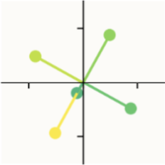
Notice how the yellow vector and the teal vector share the same direction, but different magnitudes. This means that activating teal will only interfere with yellow a little bit, because it has a small magnitude comparatively. On the other hand, activating yellow will interfere a lot with teal, because it has a much bigger magnitude. Thus, interference is not a symmetrical relationship: the relative magnitude matters. Larger, more prominent features will interfere more with smaller ones.
For each (20,20) interference matrix $I$, entry $I_{ij}$ (row $i$, column $j$) encodes the dot product of vector $(\frac{W}{||W||})_i$ with $W_j$ and so we get how sensitive $i$ is to activations in feature $j$ — i.e. how much feature $j$ will interfere with feature $i$ if both are active. If we fix $i$ and move along the column, we see how sensitive $i$ is to different features, so the rows tell us how much sensitive feature $i$ is to other features, and the columns tell us how much other features are sensitive to column $j$
After setting interference between each vector and itself to be 0, polysemanticity now takes the vector norm along the last dimension, meaning we are left with vectors of shape (20,) with entry $i$ containing how much vector $i$ is sensitive to the other vectors. In some sense it is the 'worst case' interference; it accumulates across interference as opposed to simply averaging it, meaning that we're relatively sensitive to large outliers.
net_interference squares the interference matrix and multiplies it by the model's feature_probability and then similarly sums it, so that you get how much you actually expect the features to, in practice, interfere with one another. feature_probability is used to weight by how often we should actually expect to see interference occur in the wild — if a feature only activates 5% of the time then we shouldn't expect its interference in reality to be significant, even if it has the same direction and a much larger magnitude than the other feature. (The experimental setup makes each features fire independently from every other, so this is genuinely a good measure of coactivation, though not one we'd be able to use in reality for language models where features are often highly correlated.) Squaring net_interference instead of taking an absolute value makes all the values positive (so they don't cancel out); I'm unsure why we square instead of using the absolute value, but I'm guessing it has to do with outliers — squaring makes things more sensitive to uncommon, large interference events.3 We finally sum across the columns now, leaving vectors of shape (20,) as before, each entry describing something like, 'how much total interference we should expect on average.'
norms is just the norms vector, exactly like the one we used to normalize W earlier. As the name suggests, WtW is W multiplied with itself as we described above when we wrote out the toy model equations.
After this we have a bunch of plot visualization code. the important parts:
x = torch.arange(cfg.n_features)

for (row, inst) in enumerate(which_instances):
    fig.add_trace(
        go.Bar(x=x,
              y=norms[inst],
              marker=dict(
                  color=polysemanticity[inst],
                  cmin=0,
                  cmax=1
              ),
              width=width,
        ),
        row=1+row, col=1
    )
This creates our bar graphs on the left side. The x axis is the feature indices for one of the submodels (e.g. "feature #2, feature #5, etc.") and the y axis is the norms of those features. This tells us the magnitude with which these features fire. We get the color from polysemanticity vectors — so the color of the feature tells us how much each feature is sensitive to the other vectors, darker presumably meaning less sensitive.
Then we have
data = WtW[inst].numpy()
fig.add_trace(
    go.Image(
        z=plt.cm.coolwarm((1 + data)/2, bytes=True),
        colormodel='rgba256',
        customdata=data,
        hovertemplate='''\
In: %{x}<br>
Out: %{y}<br>
Weight: %{customdata:0.2f}
'''
    ),
    row=1+row, col=2
)
We create an Image object (from plotly.graph_objects) and just fill it with the unaltered values of $W^TW$. Here the colors just indicate how positive or negative the value is (since they shifted the distribution using (1 + data)/2).
We never used net_interference, actually — but having that function lying around is kind of nice, potentially, for writing my own code to extend it.
That's all I'm going to go through for part 1 of these notes. In part 2, I will review one more section of the paper and run some experiments of my own. See you then!
Footnotes
-
I'd never seen Einops before this — just did all my pytorch slicing by hand lol — but it turns out that it's supposedly standard for writing better code. If you're like me and seeing this for the first time, you can find a concise and useful article here about it. ↩
-
This popped up at the end of my notes on the Anthropic mathematical framework paper. Here's what I wrote there: "if some part of a model has a privileged basis, that means that some architectural component (e.g. an activation function) causes the model to be more likely to align features with the explicit basis (i.e. $e_1, ... e_n$ or whatever or the generalization of that if you need one). If you have a privileged basis, that's nice because you can come up with hypotheses about what those features are, without having to wonder whether or not they are features at all. Without a privileged basis, you lose some interpretability. For example, the residual stream here does not have a privileged basis. (It's "basis-free.") ↩
-
I think this is worth spending more time thinking about. Designing a single number summary statistic for interference is quite difficult; what are the properties here that make the most sense to use? Is it easier to reason about the squares, or the sum of absolute values? If I designed a metric for "how much interference matters for this feature in practice" what would make sense to use here? ↩