ⓘ This post is more than 2 years old.
The indie internet is its own distinct ecosystem. It's the digital world's soft underbelly — amidst the churning mass of algorithmic slop there are scattered oases, peopled by personal websites, anon blogs, side projects, side-projects-that-turned-main-projects; it's organic, hand-made in the way much of the surface-level internet isn't.
One corner of this indie internet1 is filled with designers. Designers, being designers, often have very designed sites — sites that you might describe as "attractive", "coherent", "innovative", and/or "intricate".2 Nico Chilla has a grid-based, theme-customizable front page, with subthemes for different kinds of content. You can shuffle the tiles around. Aaron Z. Lewis has a more conventional vertical-style site with lots of scroll animations and hover transitions, extra visual elements like headers with gradient overlays, and like Nico, distinct but connected subthemes on different pages. Sam Goddard has a one-page site, with a fullscreen page-open animation, a limited monochrome palette, and typography I can best describe as "intense."
I love seeing these sites — and yet, I find that they sometimes make me a bit anxious. I get a similar feeling to the one I get when I'm stressed about something and my room isn't clean — when I have clothes on the floor or need to do my laundry and the disorder weighs on me. It's also the feeling I get when I'm overwhelmed trying to clean out my twitter bookmarks, or when software is running too slowly, or when I'm split-focus trying to talk to someone while a sports game or TV show is going on behind their head. I get a feeling of disorder, distraction, or complexity, despite how intentionally-crafted and clearly-ordered the sites are.
This is kind of an unexpected reaction to have (?) — it's not how I'd imagine myself reacting to well-designed websites, considering the value I ascribe to aesthetics.
Part of it, I think, is that I get caught up in processing the layout and design; I get distracted from the content. I want to focus on one thing, but I'm focusing on two. Obviously, if you're a designer trying to attract clients it makes sense that you'd have a very designed website — but if the words you write, the content of your site, is the primary focus, I think having a very designed site is a bad thing.
I want to make explicit this idea of designed-ness. There can be a lot happening on a website, even if it's aesthetically "minimal" or straightforward — a lot of flourish, a lot of aesthetic intensity. (I use flourish here to mean something like "extra elements that embody and reinforce the aesthetic of the site."3)
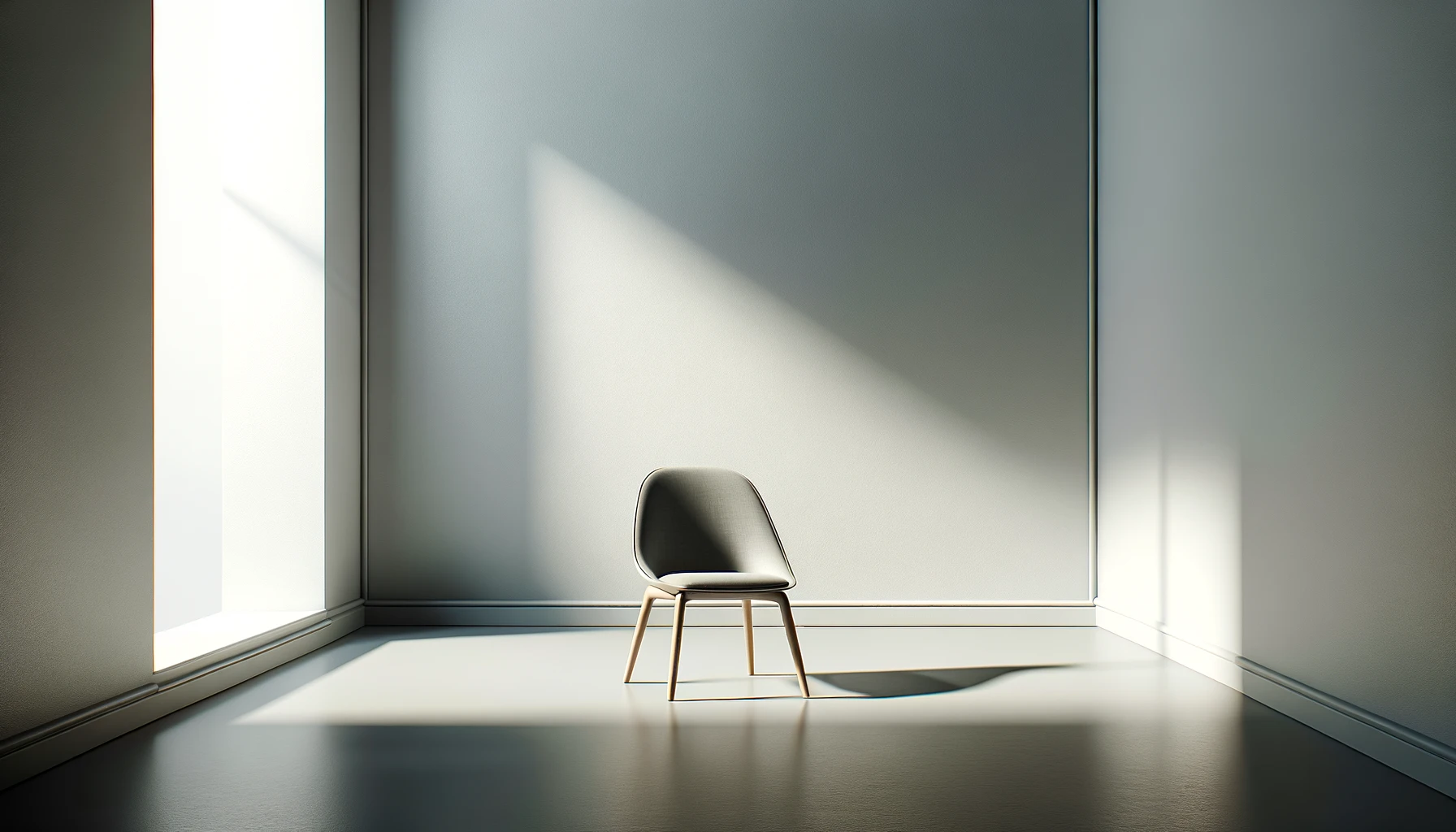
In this design corner of the internet there's also a common genre of minimal design, with small sans-serif text, elements floating in space, white-on-black. Some examples I have lying around on my design inspiration note:
I like these sites, but sometimes I can still feel like they're too designed for me despite their minimalism. (Note the word "for me" — this is not really a critique of their design choices; it's much more of an expression of personal preference.) Even minimality can be overbearing.
In my experience, aesthetics become easily overbearing; form impedes function. So since I get to design my own space here, I'll take what I'm noticing and try and turn description into prescription: I want to design without designing.
- I want to do as little "designing" as possible here; I want to make the page attractive and readable, expressive but never overwhelming or complex. I will try not to design. 4
- I want visitors (Wanderers? Garden-goers?) to feel like they're anchored where they are, and to have a strong internal model of the site's architecture.
- I want the site to feel focused and intentional; Design and flourish should support and blend with this site's contents, never impede it.
- All of the above apply until vibes are better (?) not to apply them.
I think this is why the garden metaphor appeals to me. I feel focused and intentional in a garden. I don't get lost, I just wander; I don't get overwhelmed, I just get immersed.
As the amount of content on the site increases, I'll allow order to emerge from the ground up.
Footnotes
-
Among many other corners. We'll say the internet is a hypercube or something I guess. ↩
-
At some point I'd like to try an analytic philosophy-style deconstruction of the idea of design — there is a lot going on there, and I want to try and have better clarity on what I'm talking about when I use the word. But this is not the post for that. ↩
-
Flourish might look different depending on the overarching aesthetic of the page. Aaron Lewis' site has flourish in its css animations and differently-styled subsites; Nico Chilla's site has flourish in its theming too, as well as in the block-shuffling interactivity, the scattered links+arrows, and bitmap-style images. ↩
-
Many other people thought of this before me (Notably industrial designer Dieter Rams, also like every minimalist ever) and it filtered down into my consciousness, making me feel like I figured it out myself. I think this is how understanding good ideas is supposed to feel — comprehending an anti-meme or something. I'll write a blog post about this eventually; for now here's someone else's twitter thread. ↩